Hammer film productions are an example of a film producer that produces many thriller films, they have made many films. an example of a film they produced is 'the mummy'. There production logo used the thriller related colours of black and red to create a thriller theme. the colours look dark and work well to scare the viewer.

Often in the production logo's there is text, the text is used as a main part of the logo and lets the audience know exactly who they are if they haven't yet known about the producers. In our production logo we will use text and the rest of the image will be styled round the text, we will use colours like black to create a dark thriller type themed logo. we may include a image that is related to the genre such as a knife or blood.
In many production logo's there is just a simple image such as a landscape/symmetrical and related imaging. In the thriller based production logo's there are often a creepy image such as a blood hand print or a blade.
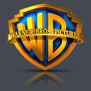
When looking at the Warner bros pictures production logo, the logo's image is very simple and doesn't include to many lines/different shapes. its just simple shapes put together without many different colours. This means it is easily recognized by the viewer and when the viewer see's the image again they will instantly recognize who has made the film.
This blog was created by Toby Moffat, George Tibbett, Graeme Beck and Andrew Thomson.
No comments:
Post a Comment